As one of the UK’s largest home care providers, Bluebird Care needed a brand that reflected its scale, quality of service, and deeply personal approach to care.
In a category often shaped by clinical visuals and cost-led messaging, this was an opportunity to lead with something warmer, more emotionally resonant, and confidently premium — while maintaining consistency across 220+ franchises nationwide.
We reimagined the brand from the inside out, repositioning Bluebird Care around what truly sets it apart: the quality of care, the strength of relationships, and the comforting reassurance that comes from being supported in your own home.
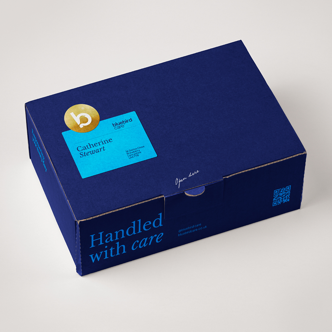
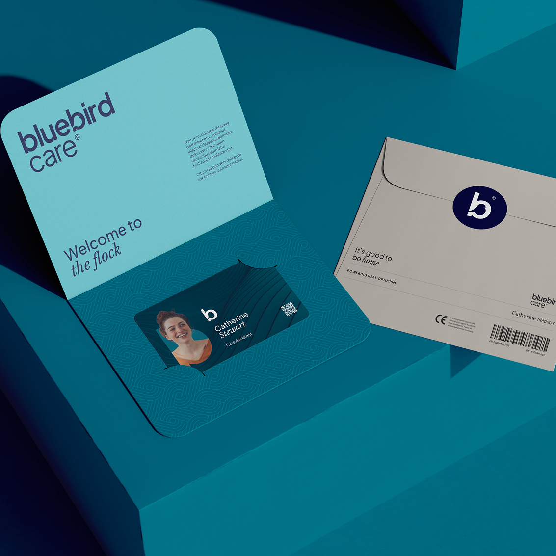
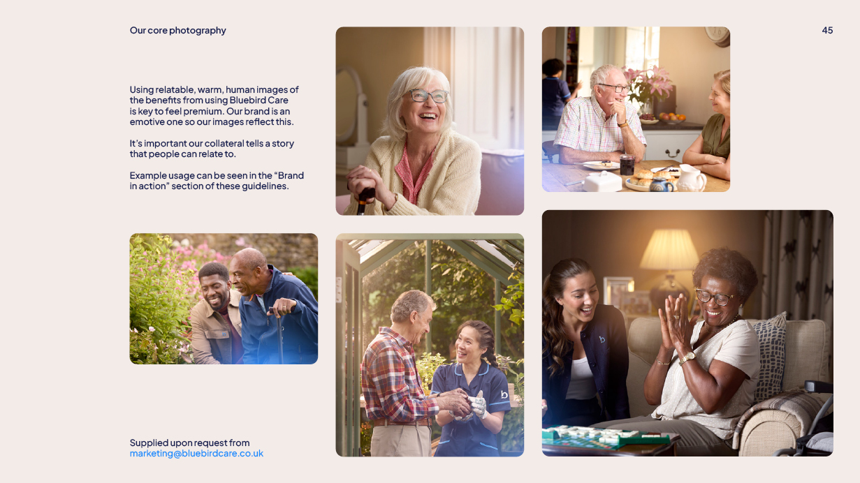
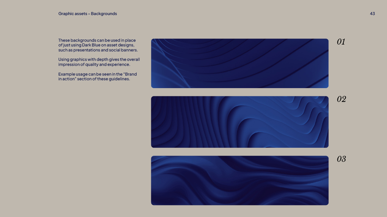
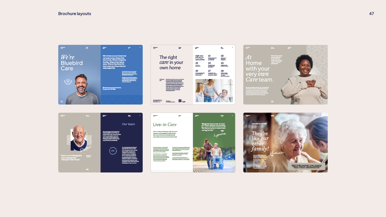
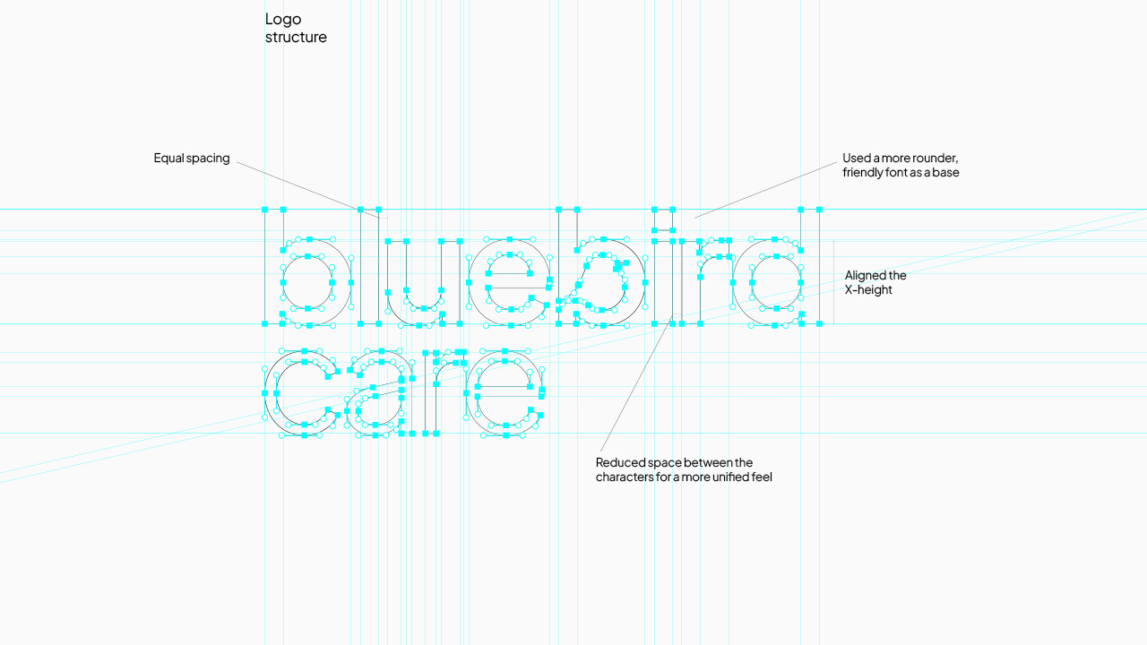
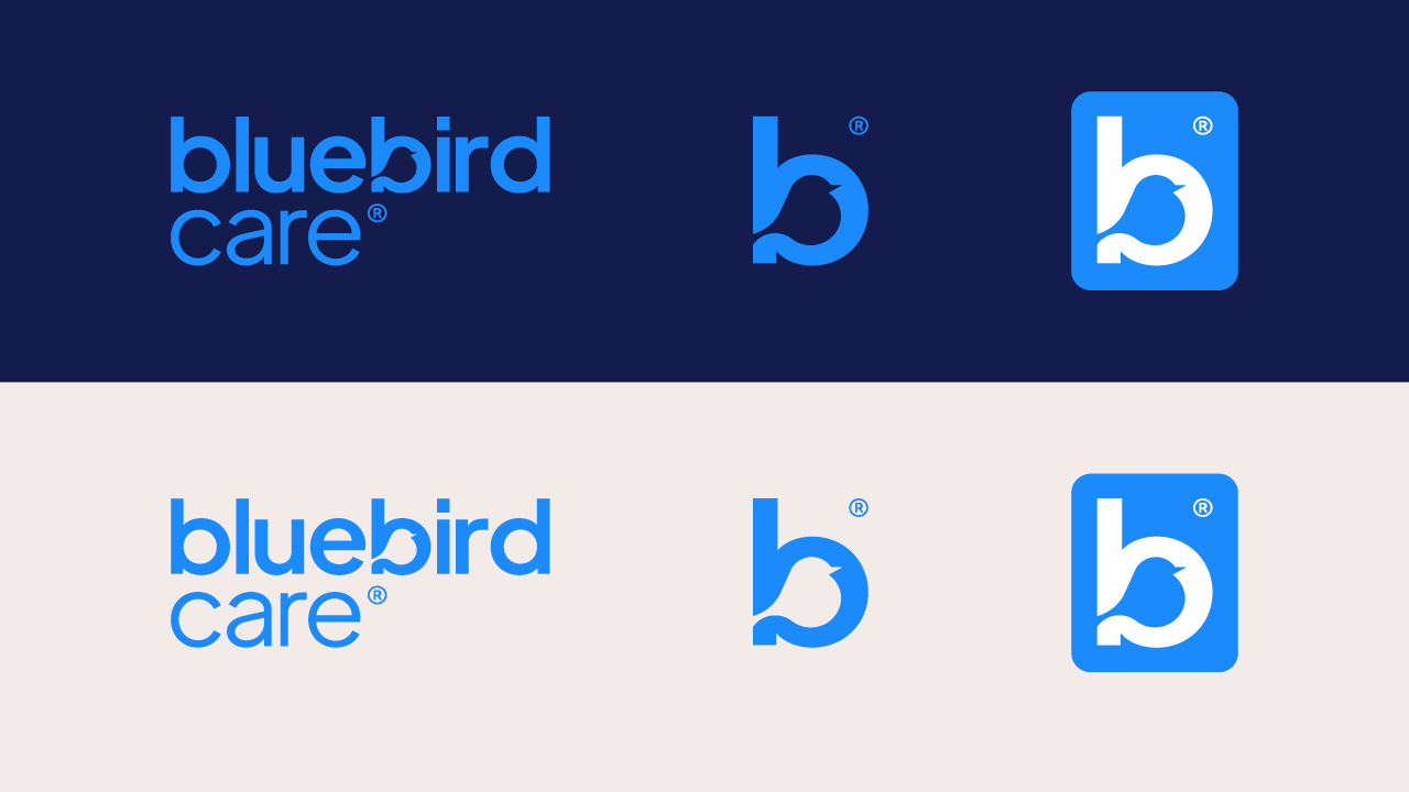
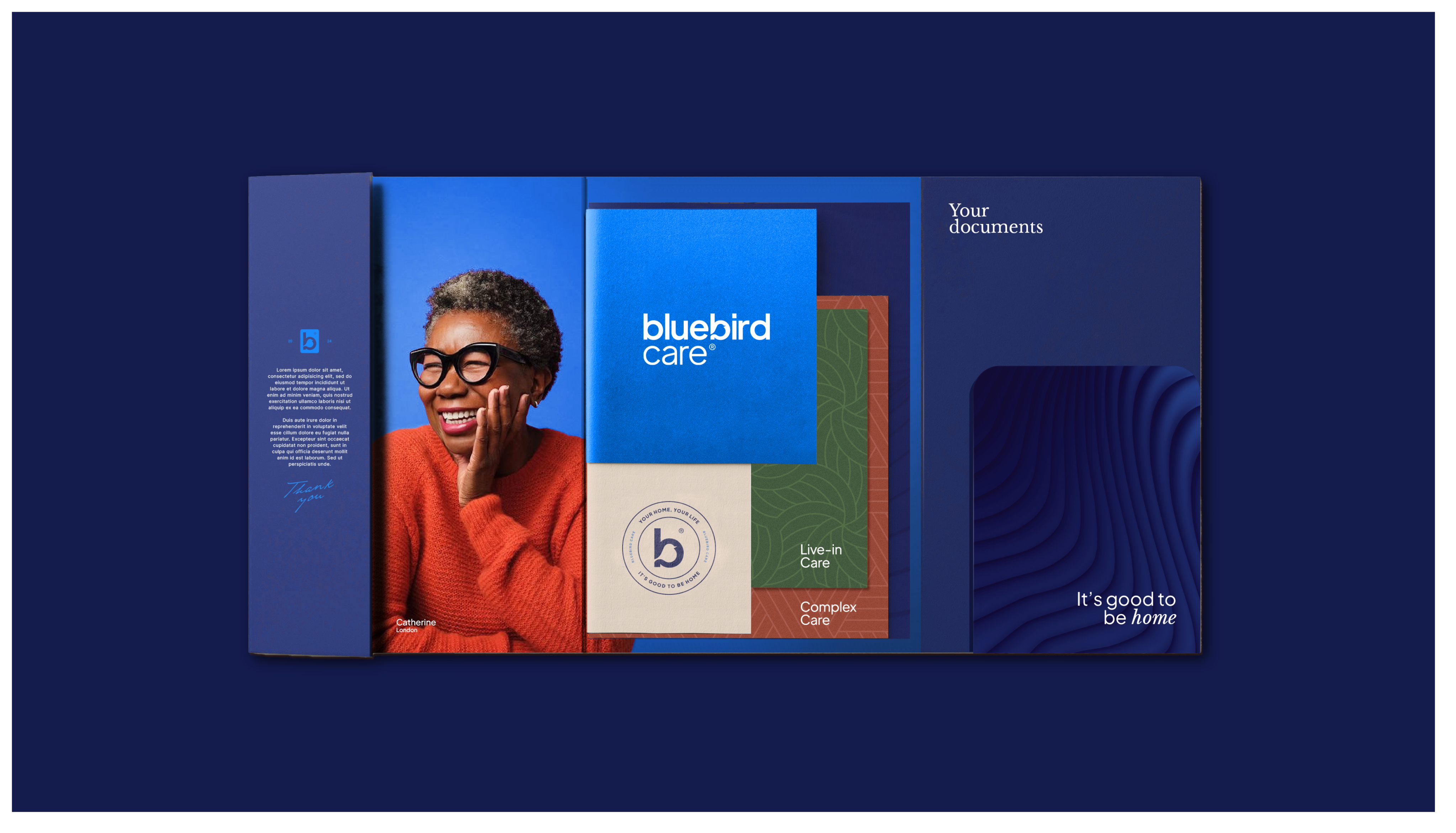
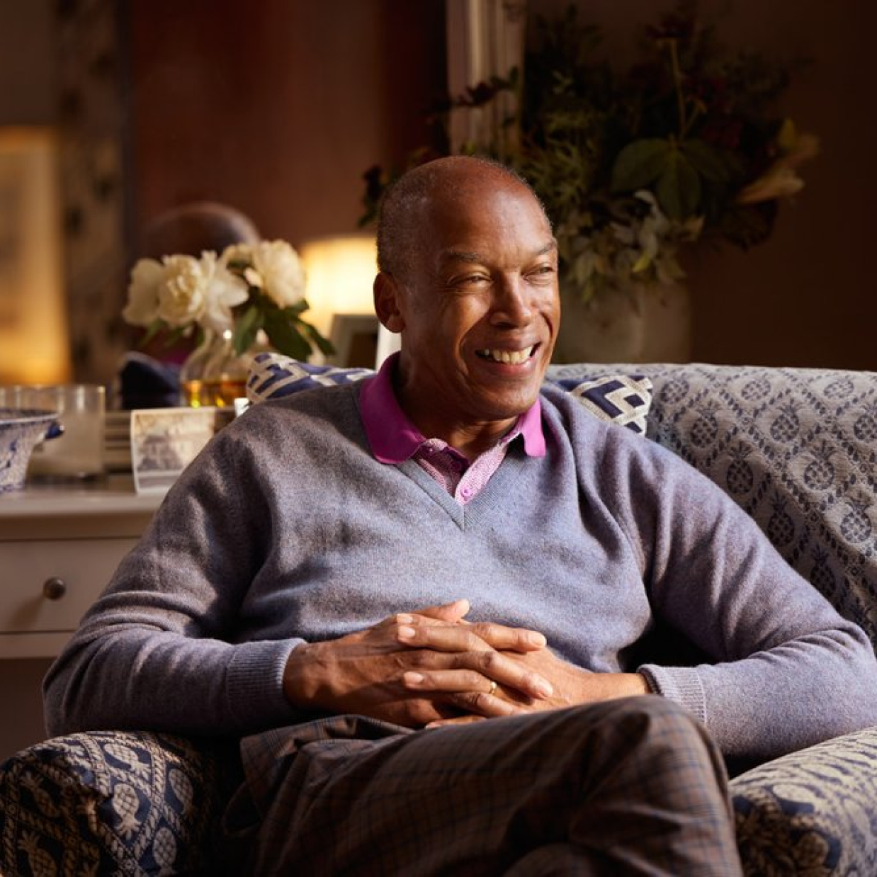
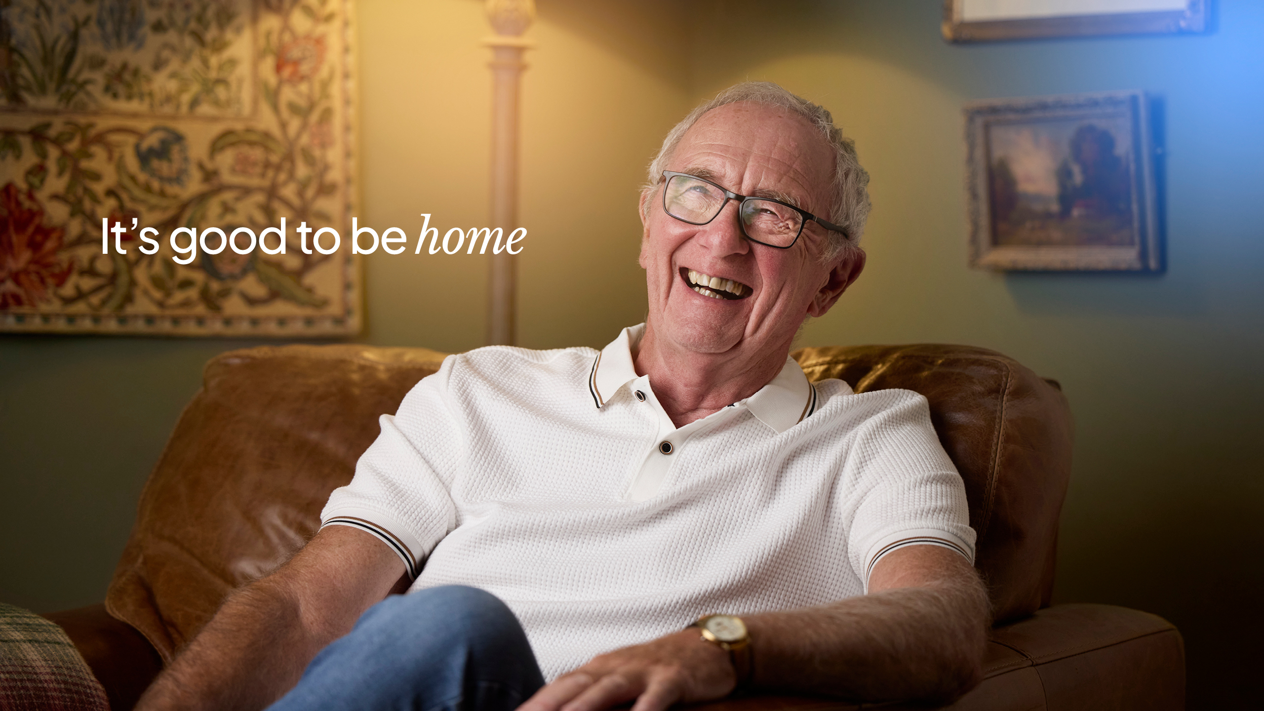
We began by refining the brand’s core assets. The logo became bolder and more rounded, while the colour palette softened into a warmer, more premium blue. A complementary system of tones, textures, and modular patterns supported local adaptation and reflected the richness of each care journey. Photography shifted from staged and clinical to candid, empowering moments of connection. Carers and customers, side by side. Life being lived joyfully, independently, and with dignity.
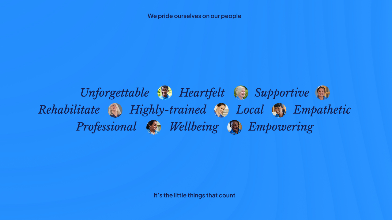
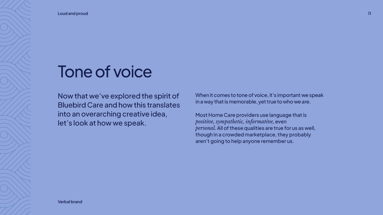
The brand narrative and tone of voice were also refined to reflect the emotional pulse of the brand, speaking clearly, compassionately, and from lived experience.
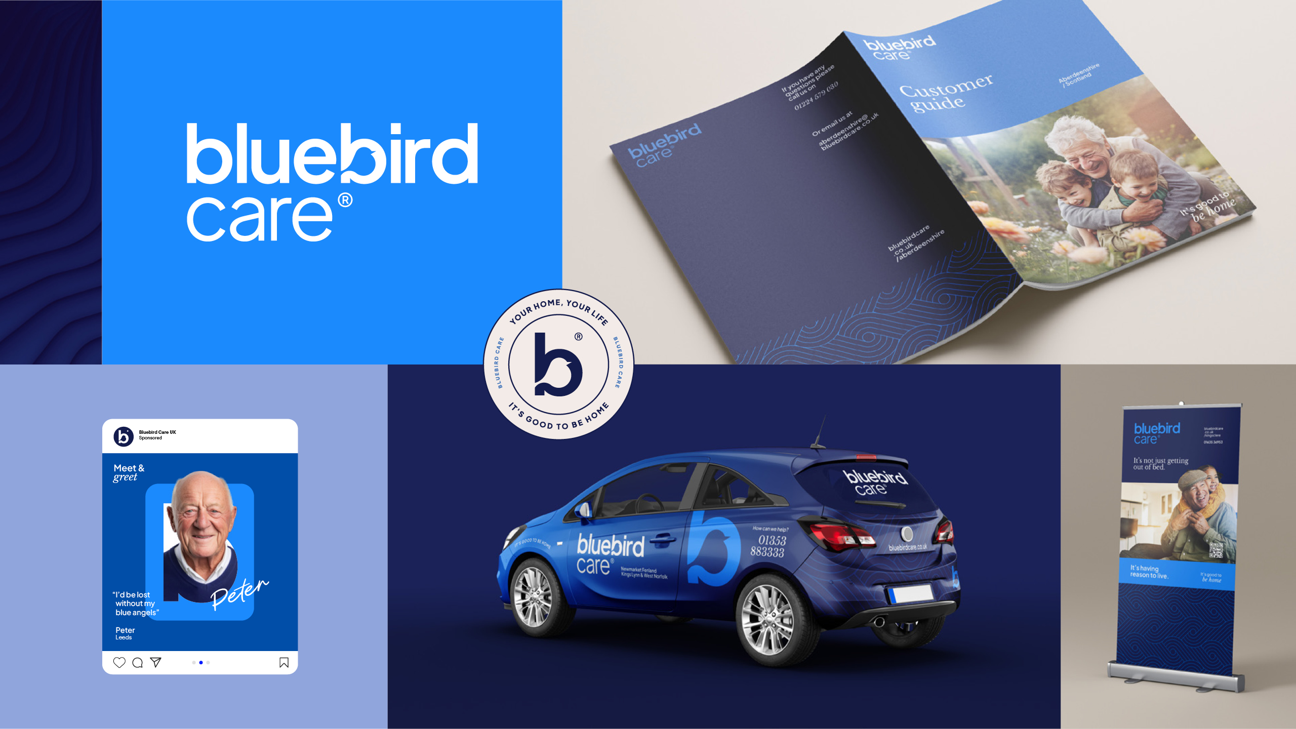
The result is a future-facing brand that feels like a breath of fresh air in a traditionally clinical category. A brand that balances warmth, trust, and emotional intelligence — rolled out across every corner of the UK, from Ashford to Aberdeen.
